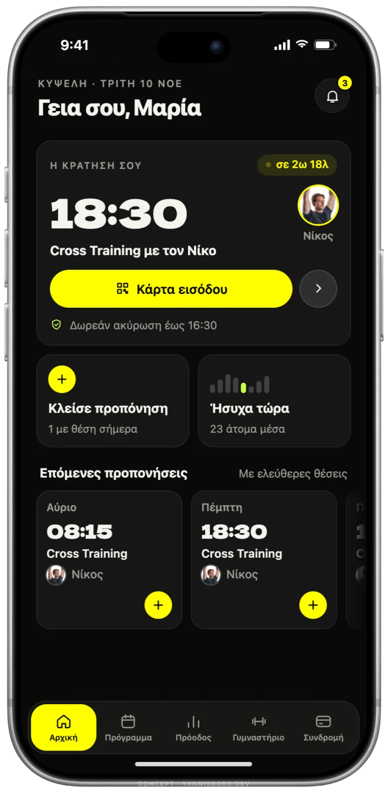
Open the app and you see when, where and with whom. The entry pass is one button away, and the free cancellation deadline is written under it.
Today: three counters for absences, bookings and subscriptions, most of them at zero, and a barcode.
Concepts / Alterlife
Concept · iPhone app · Unofficial
One of Greece's biggest gym chains has an app that makes you work before the workout. Booking a class takes four screens, a search form and a checkbox. This concept puts your next class, your trainer and your pass on the first screen.


Three counters at zero and a barcode → your booking, with the trainer.
Drag the yellow line. The app today on the left, the concept on the right.
Screens to book a class. From home you tap the time and confirm. Two taps.
Memberships, one app. Cross Training, Pilates and personal training each see only what they can book.
Searches. No date range, no form. The day is a list, the month is a calendar.
Free cancellation, in plain sight. The deadline is worked out for your class and sits next to the button.
Four steps, in the order they happened.
I’m a member at Alterlife Kypseli. Before drawing anything, I booked through the app the way I always do and wrote down every step that slowed me down.
Nine screens, side by side. Booking took four of them, a search form and a checkbox. The home screen answered none of the questions a member actually has.
Home: when is my next session, and with whom? Schedule: what can I book today? A session: who teaches it, how many places, until when it’s free to cancel. Whatever didn’t answer the question went.
The concept is a working prototype in code, not pictures: booking with a confirmation, cancelling, three memberships, a month calendar. Using it showed what was still too much, so the second pass removed almost half of it.
From opening the app to the confirmation: four screens, no form, no search.
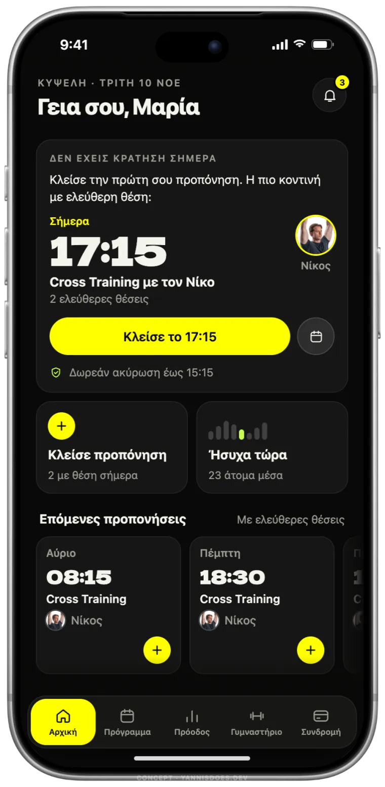
With nothing booked, home offers the nearest class with a free place, and its trainer.
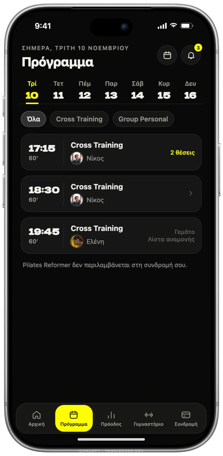
The day as one list, with the trainer on every class. The calendar for the month.
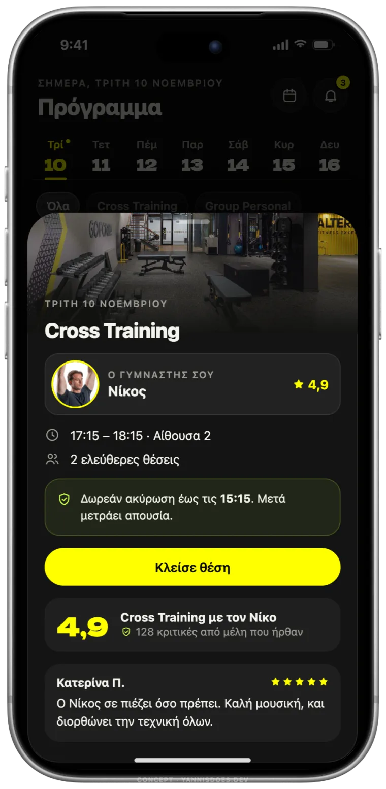
Who teaches it, places left, the free cancellation deadline. One button: book.
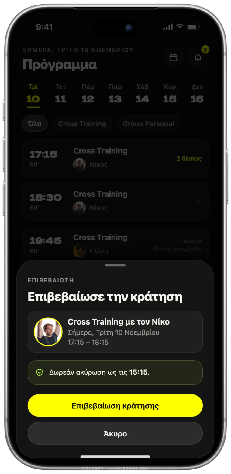
Booking needs a second tap, like a delete. The sheet repeats the time, the trainer and the free cancellation deadline.
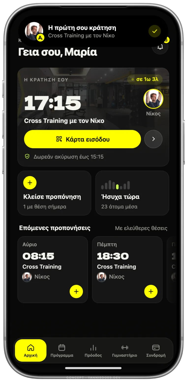
The confirmation lands in the Dynamic Island with the trainer’s photo. Home shows your booking.
The nearest class with a free place.
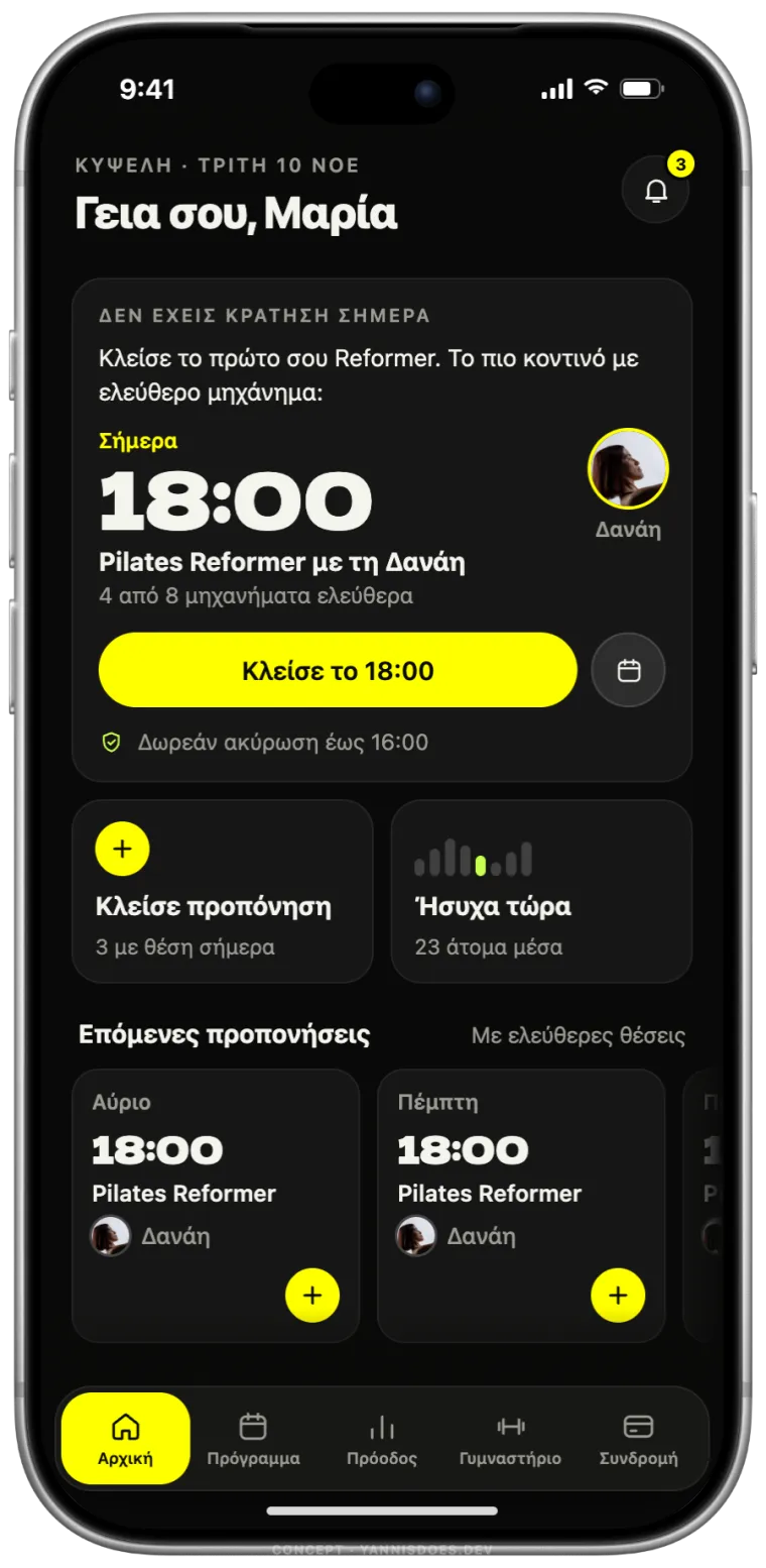
The nearest Reformer with a free machine, and classes left this month.
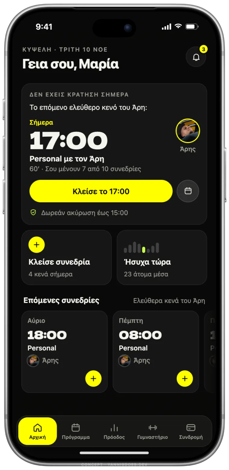
The trainer’s next free hour.
The current app on the left, the redesign on the right. Personal amounts on the old membership screen are blurred.
TodayConcept Today
 Concept
 Today
 Concept
 Today
 Concept
 Today
 Concept
 Today
 Concept
 Today
 Concept
 Today
 Concept
Five decisions, each one about the thing a member opens the app to do.
Open the app and you see when, where and with whom. The entry pass is one button away, and the free cancellation deadline is written under it.
Today: three counters for absences, bookings and subscriptions, most of them at zero, and a barcode.
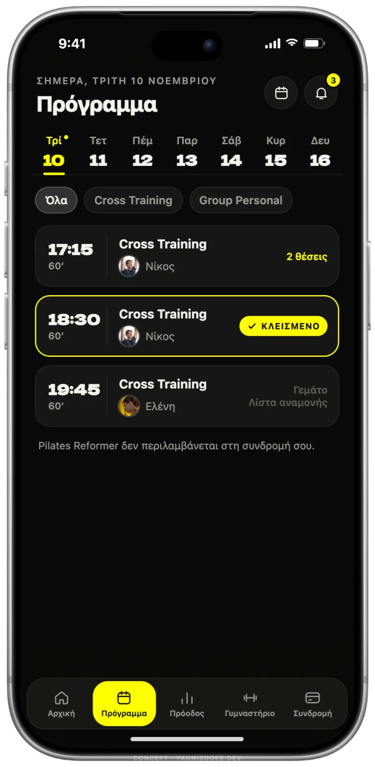
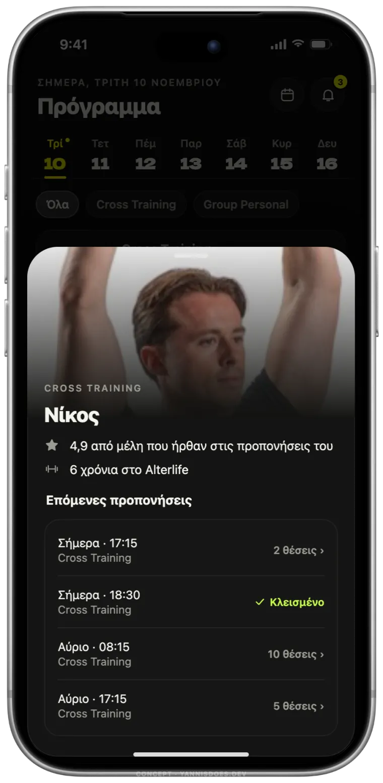
People choose a class for the person teaching it. Every class shows the trainer's face, and every trainer has a page with their rating and next classes.
Today: identical rows with a time, a class name and a checkbox.
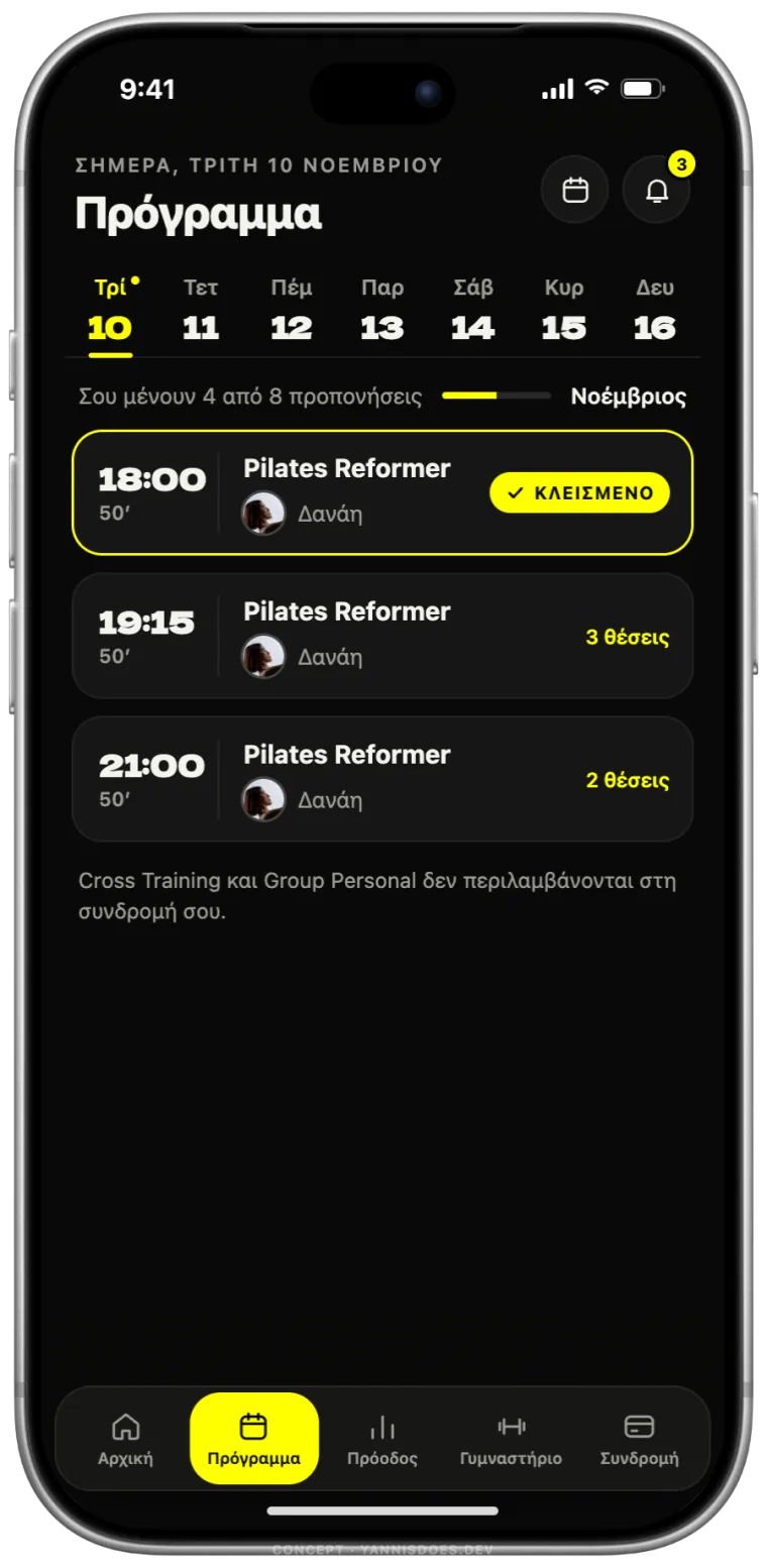
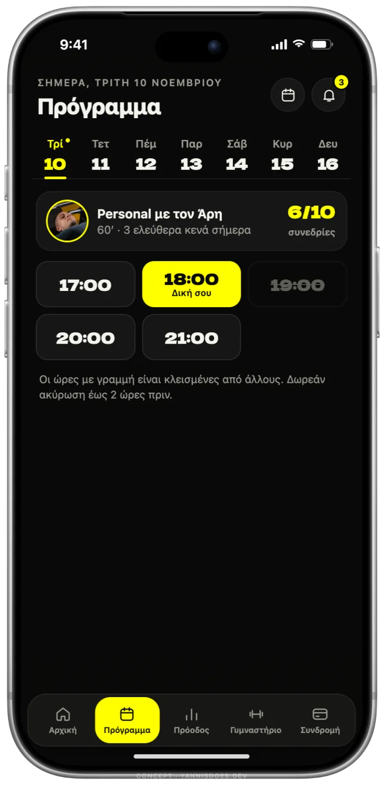
A Pilates member sees Reformer classes and how many are left this month. A personal training client sees their trainer's free hours. Nobody scrolls past classes they can't book.
Today: one list for everyone, and you find out at the end that a class isn't in your plan.
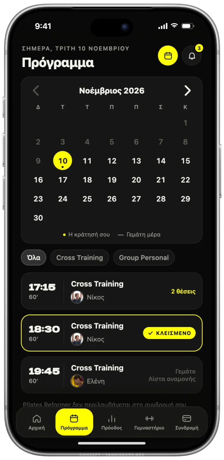
A week for the everyday, a calendar for planning ahead. Your booked days carry a dot, full days are crossed out, and one tap opens any day.
Today: a form with a start date, an end date, a time range and a search button.
After class you rate it in two seconds. Before booking, you read what members who actually attended said, next to the free places and the cancellation deadline.
Today: no reviews, and the rules sit behind a pop-up.
The real prototype, running in your browser. Switch the membership, book a class, open the calendar, freeze the plan.
Tip: start from the login, or press “Από την αρχή”.The app is in Greek, like the real one.
Rethinking what each screen is for, and rebuilding it around the thing people open the app to do. Not a new colour scheme: fewer steps, clearer screens, the same information underneath.
No. It’s an unsolicited concept, made because I use the app every week. Alterlife’s name, logo and photography belong to Alterlife.
Usually not. This concept uses only information the current app already has: sessions, places, trainers, memberships and the check-ins at the door.
The first screen takes about a week. A whole app depends on how many flows it has, and you get a date before anything starts.
Yes. Send me the link and you get a before and after of one screen, free, within a week.
I pick apps and sites I use that make me hunt for things. The next one could be the one that annoys you.
Send me the link to your app or website. You get a before and after of one screen, free, within a week.
An unsolicited concept, not commissioned by or affiliated with Alterlife. Alterlife's name, logo and photography belong to Alterlife. Member details, trainer names, ratings and numbers in the prototype are fictional. Device frame from Apple Design Resources.